As I mentioned the other day in my initial post about students in Art Novak’s class at the Savannah College of Art and Design creating Significant Advertising, a surprising number chose the Amoco Yo Yo + Mark Sarvas Story as their subject. I asked why, but I knew the answer: “C’mon, dude … it’s a yo yo!”
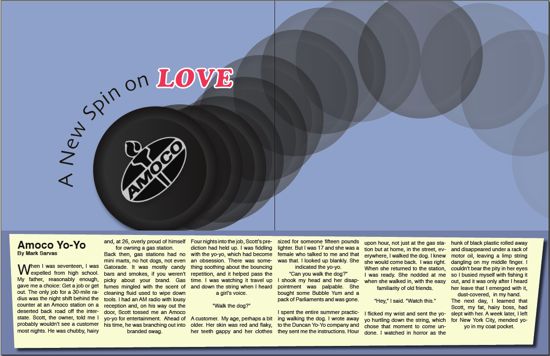
Sometimes I overthink things. Anyway, today I present a menagerie of Significant Advertising that leaps off from that story and object. Above is a print ad made by Deaa Bataineh, suitable for, say, an art/culture magazine. Below, a couple of Flash-driven Web ads made by Maggie Russell. These got a very positive response from her classmates (and me of course).
[swfobj src=”https://significantobjects.com/wp-content/uploads/2010/02/yo-yo-1.swf” align=”center”]
Another here:
[swfobj src=”https://significantobjects.com/wp-content/uploads/2010/02/yo-yo-3.swf” align=”center” allowfullscreen=”false”]
You’ve already seen Alexander Parker’s creation, also Flash-driven. One more of Ms. Russell’s ads after the jump, along with a bevy of print ad solutions to the challenge of advertising a Significant Object.
[swfobj src=”https://significantobjects.com/wp-content/uploads/2010/02/yo-yo-2.swf” align=”center” allowfullscreen=”false”]
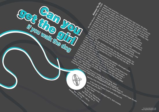
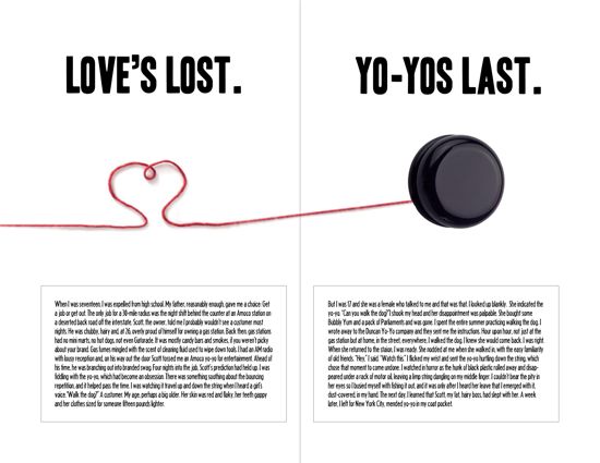
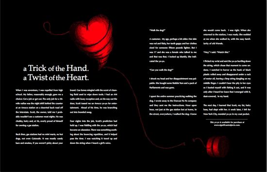
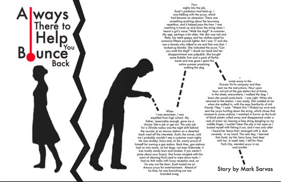
Here’s some more proposed print advertising:
Above by Nicky Bickerstaff.
Below by Michelle Wiseman.
Above by Marissa Pierce.
Below by Kelsey Heuvelman.
I was struck by how many of the print ad proposals — often featuring original art by the students — would work really well as editorial layouts. Significant Objects does a fairly good job, I think, of presenting our stories in a visually pleasing manner. But this experience was an eye-opener in terms of considering the graphic possibilities available in print formats.
Readers, what do you think about these presentations? SCAD students would love to know!




These are amazing. Food for thought for you, for a future project???
P.S. My favorites are by Marissa Pierce and Nicky Bickerstaff. So well done.
Folks, please forgive the delayed response – but I am completely blown away by the remarkable efforts of these talented students. It’s such a thrill to see this work. Thank you!!!
Kudos to the students – very creative. They showed a great use of graphics and headlines (all of which were clever plays on words). Nicky’s really pops, and Michelle’s would be great for a performing arts group (it makes me think of Phantom of the Opera). Michelle’s also proves that fully justified text is not always a bad thing as is reversed out text (generally harder to read).